As website building becomes simpler for the everyday user, it can be frustrating to try to stand out amongst the masses. That’s where website designers come in- Designers understand the nuances of aesthetic and functionality that can push your website to the forefront of the mob. When thinking about your new website, here are the 4 best web design principles that will help you work with the designers to create a visually appealing site that will have consumers flocking to your page:
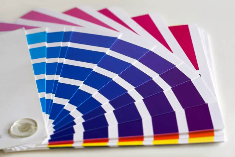
- Color Theory
Colors have connotations and not all of them are good. Choosing colors that sign harmoniously together on your website can create a pleasant feeling in the consumer, while colors that clash calamitously can incur a much different reaction. Using concepts of color theory in choosing the scheme for your website is one of the first steps in web design, because every other element will be based around it. If your website is for a spa, gentle blues and mellow greens might be lovely options, because they play well together. For a paintball site, the scheme would be much different, with splashes of bright color. Sites like Coolors can help those new to color theory create coordinating palettes.
- White Space
It can be tempting to use all of the room on a page, but an overload of information has a negative effect on readers. Utilizing white space- simply areas where there is nothing- gives your website room to breathe and can be used to guide the eye through the page. It also helps particular elements pop. Surrounding a very important graphic or piece of text with white spaces draws the eye and assures that the viewer will pay attention. It is one of the easiest principles to implement because you’re not actually adding anything.
- Typography
Sometimes the freedom of choice hinders us. This is particularly true when it comes to choosing fonts for a website. There are millions of them, available through programs and downloads, and they are available for any occasion. Some basic things to keep in mind are that san-serif fonts work best for digital reading, while serif fonts work best for print. If you’re concerned about font compatibility on all machines, one CCS trick is to font stack. That means that you get to define what the fallback font is if a particular font is not available on a user’s computer, instead of the font defaulting to something that may not work for your site. Perhaps the most important rule of typography is to choose something that communicates your message: If you’re corporate, you wouldn’t choose a casual, script font and if you’re a craft store, you wouldn’t choose something stark and serious.
- Graphics
Graphics can be daunting, because not everybody is trained in graphic design. Luckily, with stock images, a little, free PhotoShop training with sites like Alison, and a good eye, you can implement graphics into your site that draw attention to your message. Depending on the purpose of your website, your need for graphics can change. If you’re looking for something more minimalist and informational, carefully implementing a beautiful background or a simple logo can drastically change the look of your site. If you’re looking for something a little more free-spirited, graphics may be the focus of the site, with text taking a back seat. Whatever your goal is, it’s crucial to remember that users will likely look at the graphics before they read the text- it’s easier to process graphic information than text information. Graphics on your page will make the first impression.